Showing posts with label Amulet Books. Show all posts

Wednesday, March 19, 2014

Latest News

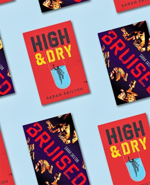
To celebrate the upcoming release of HIGH AND DRY on April 15th (as well as BRUISED coming out in paperback with a brand-new look), my husband Joe Skilton made this graphic. Cool, eh?


  • Kirkus Reviews calls HIGH AND DRY, "A dark, well-constructed mystery with a strong voice."  
  • For more information on Teen Book Festivals happening throughout Southern California this spring and summer, check out my website.

Sunday, October 6, 2013

COVER REVEAL: HIGH AND DRY

My contemporary YA mystery, HIGH AND DRY, comes out April 15th, 2014 from Amulet Books! I love the gritty cover:


What's HIGH AND DRY about?

Framed for a stranger's near-fatal overdose at a party, blackmailed into finding a mysterious flash drive everyone in school seems anxious to suppress, and pressured by his shady best friend to throw an upcoming game, high school soccer player Charlie Dixon spends a frantic week trying to clear his name, win back the girl of his dreams, and escape a past that may be responsible for all his current problems.


Wednesday, March 27, 2013

Four Places to Win a Free Copy of BRUISED

1. The Nocturnal Library (six more days to win!)

2. Books, Bones & Buffy (two more days to win!)

3. A Thousand Wrongs (one more day to win!)

4. And coming tomorrow... a chance from YA Fresh

Thanks to Maja, Tammy, Laurisa, and Tina for hosting these giveaways.

And if you strike out this time, check back here in April for at least two more chances!

Happy reading.

Wednesday, February 6, 2013

Cruisin' for a Bruisin' (Sorry. Really.) BRUISED Links

Here's my latest book news:

1. BRUISED received a starred review from Publishers Weekly.

2. The book comes out in 1 month! You can pre-order it all sorts of ways.

3. I have one last ARC (advance readers copy) and I'm giving it away on GoodReads.

4. Read an exclusive excerpt from the book at Alice Marvel's site.

5. "Readers in Wonderland" blog reviewed BRUISED as part of their Debut Author Challenge series.

6. If you take a picture of BRUISED out in the wild (aka at a library or a bookstore) and send it to me, I'll mail you a limited edition signed bookmark. (Limited edition because I ran out of money.) (But they look really cool.)

To get a bookmark, just tweet me the photo, post it on my Facebook Page, or email it to me: bruisedbook [at] gmail [dot] com


Wednesday, January 30, 2013

"What The...?!" Wednesday #2: What is ALA, and What is the ALA Conference?

Funny you should ask, as I happen to have spent this weekend at the ALA Conference in Seattle.

There will be pictures and everything. Hold on to your hats!


(Okay but seriously feel free to jump in with your own questions anytime. This one's kind of a gimmee.) ------>

Anyway, ALA stands for the American Library Association, and the ALA Conference is a week-long event in which librarians, publishers, authors, book reviewers, book bloggers, school teachers, publicists, marketing directors, avid readers, and even library suppliers (those enormous "return" bins outside libraries have to come from somewhere) meet up at a convention to discuss the state of the industry from several angles.

Me and Mom outside our hotel in Seattle
The conference I attended was the Midwinter Meeting and Exhibition. The ALA Annual will occur June 27 - July 2 in Chicago.

Some publishers use their booth to give away advance copies of their upcoming books, plus posters, calendars, and other swag. Others host book signings and buzz panels to showcase established authors or introduce debut authors to the world.

Image Blatantly Stolen from AbramsKids Instagram

My Very First Book Signing! Photo Credit: Mom

Bonus WTW Question: Why on earth would publishers want to give away free copies of their yet-to-be released books to hundreds, nay, thousands of librarians?

Bonus WTW Answer: In the hopes that those librarians will fall in love and purchase final copies for their libraries.

Bonus, Bonus Answer: Forging personal connections with librarians isn't just good business, it's fun.

My publisher, Abrams/Amulet, very generously arranged for me (BRUISED), Cat Winters (IN THE SHADOW OF BLACKBIRDS), Patrick Jennings (BAT AND RAT), Tom Angleberger (FAKE MUSTACHE, Art2 D2), Nikki McClure (HOW TO BE A CAT), and Margi Preus (SHADOW ON THE MOUTAIN) to participate in the convention.

I've never done a book signing or spoken publicly to strangers about my book, so needless to say, I was excited but nervous. Luckily, I had a secret weapon: my mom, a former librarian, traveled with me. Yay, Mom, you're the best!

We had a lovely time, and I'm grateful to the Abrams team -- Maggie Lehrman, Jason Wells, Cecily Kaiser, and Laura Milhalick -- for including me in the festivities.

Jason, Cecily, and Maggie Introduce the Spring '13 Catalog
I spoke at a book buzz panel, a librarian luncheon, and a local bookseller dinner. I also signed copies of BRUISED at the awesome Abrams booth, and flew home with a bag full of books from throughout the exhibit hall.

Want more scoop from ALA Midwinter? Check out Cat Winters' blog for her take on the weekend.

Cat Winters (IN THE SHADOW OF BLACKBIRDS) and me outside the Abrams Buzz Panel

Thursday, January 10, 2013

Art Designer Maria Middleton Talks About The Cover for BRUISED & More!

I'm extremely excited to post the following behind-the-scenes interview with Maria T. Middleton, the talented Associate Art Director at Abrams Books.

Welcome, Maria!
Before I ever knew she'd be designing the cover for my book, I'd admired her breathtaking work on such stand-out titles as SHINE and BLISS by Lauren Myracle, SPLINTERED by AG Howard, and ONE DAY AND ONE AMAZING MORNING ON ORANGE STREET by Joanne Rocklin. Check them out:


Here's Maria in her own words about her process, and how she came up with the cover for my martial arts-themed book, BRUISED (below, available March 5th!)


How did you get started in art design? Was it something you always hoped to pursue?
I was always one of those "artsy" kids, but didn't really get into graphic design until high school. I was the editor of my high school yearbook, so in addition to writing articles, I was also responsible for the theme and design of the book: creating spreads, placing photos, text, captions, sidebars, etc. (Which is pretty much what I do now!) Aside from appealing to my slightly OCD personality, I loved the creative process of bringing stories to life. Having this foundation, I went to art school and knew design was what I wanted to pursue.  

Did you have a favorite book cover growing up?
Yes! The True Confessions of Charlotte Doyle by Avi. I thought the illustrated Charlotte Doyle—with her blue eyes and 80s wind-blown brown hair—was SO pretty. (I think I actually took the paperback with me to the hair dressed and said, I want my hair to look like that.) It's still one of my favorite novels.

Which covers stand out for you today as being particularly remarkable, evocative, or beautiful?
Oh, there are so many! One of my favorites is the Beautiful Creatures series designed by David Caplan. The third book in the series, Beautiful Chaos, literally called to me from the shelf in the bookstore. The typography is stunning and the special effects are perfect—especially the soft-touch matte lamination, which makes it impossible to put down. Bunheads, designed by Tracy Shaw, is another great cover, as is Chasing Lincoln's Killer designed by Phil Falco and Lizzy Bromley's insanely, incredible double-sided jacket for The Blessed.  

How many sketches or drafts do you typically go through before a cover is finalized? Have you ever gotten it right with the first try?
It really depends on the project. For Lauren Myracle's Shine, I probably did something like 15 exploratory comps before landing on the right idea. With other projects, like Shelley Coriell's YA novel, Welcome Caller This is Chloe, my first idea ended up becoming the final.  

How many books do you design for Abrams/Amulet a year, and how do you go about designing them? Do you jot down ideas as you're reading, or read first and brainstorm later? How did you go about it for BRUISED?
In the course of a year, I'll design/art direct about 25–30 titles. For novels, I like to read the manuscript first, 1) because I'm a big kid at heart and YA/middle grade fiction is still my favorite, and 2) I think the best ideas for covers come straight from the text. I'll sketch ideas/thoughts while I'm reading and then discuss them with the editor to make sure we're on the same page. I think editorial input is really helpful because most editors have a vision for a project and I like to use that vision as a spring-board for the design. Bruised happened exactly this way.  

Many YA books in the past few years have used headless models, or partial images of teenage girls. Your cover for BRUISED is symbolic rather than literal, which I absolutely love. How did you come up with the broken trophy concept for BRUISED?
First off: I love this story! I took Tae Kwon Do as a kid, so Imogen's character appealed to me immediately. After reading an early manuscript, I knew there were three things I wanted to convey with the cover: the female narration, the sense of loss/brokenness, and the martial arts angle. My first comps were actually more literal and less symbolic, but I changed course after talking to the book's fabulous editor, Maggie Lehrman, who wanted something very iconic. So I started browsing stock photos for visual metaphors for martial arts, which is where I came across the trophy.

On its own, the trophy checked two of my three requirements—I just needed to add the element of brokenness. Separating the limbs from the body seemed like the most obvious way to show brokenness, so I didn't explore that right away. At first I tried making the trophy look rusted, then corroded, then burned, but those effects started to muddy the graphic approach. In the end, the clean breaks worked best. And splaying the limbs at weird angles rounded out the idea.

How important are colors when setting a tone, mood, and style? What mood were you hoping to evoke for BRUISED by using a gradient blue background, red title font, and a gold trophy? Are there any colors you generally stay away from?
Color is a powerful tool, ranking right up there with concept, composition, and typography. There really aren't any colors that I specifically avoid, but I do gravitate toward complimentary and primary color schemes, which I used for Bruised. Because the trophy is an orangey-gold, I knew it would pop on a darker background. Solid black was striking, but seemed a little too heavy, so I replaced it with blue (orange's compliment) and the gradient adds depth and brings the focus right to the trophy. It also gives a subtle sense of rising or transformation, which is key to Imogen's journey. I will admit that red is my favorite color (so use it a lot!), but I chose red for the display (or title) type because it vibrates ever so slightly on the blue background, and that creates a sense of tension that prepares readers for the story within.  

Something I never realized until going through the publishing process is that art designers don't just focus on covers, but inside elements as well. Tell us a little bit about the inside design for BRUISED. How do you go about choosing fonts, spacing, chapter headings, page number placement, etc.? What factors go into your decisions?
As a book designer, it's my job to ensure that a book feels like a package deal. I view design as the glue that aesthetically holds a book together. Continuity in design can add to the storytelling process when all of a book's elements (fonts, end papers, margins, jacket effects, folios, etc.) work together to carry the theme of the book from cover to cover.

For novels, the design process almost always begins with the cover, so a book's interior should feel like an extension of the cover. With Bruised, the cover is minimal and graphic, so I wanted the interior to mirror that aesthetic. Being the typography-nerd that I am, I like to believe that the main body font sets the tone for the text, so I always begin there. I wanted a more angular, slightly modern serif that would pair well with Democratica, the display type, so I chose Spectrum (designed in 1952 by Jan van Krimpen) because it has those qualities as well as a vulnerability that seemed fitting for Imogen's character. The chapter pages are very minimal, containing just one illustrated element: the blood spatter from the cover. I reused the display type for the chapter numbers and folios because the Democratica letterforms are quirky and add visual interest.

As a reader and designer, I love generous margins, so I always try to incorporate that into my design. But with Bruised in particular, I wanted to balance the tension of the cover with a delicate lightness that would flow from page to page.

I would say you did a fabulous job, Maria. Thanks so much for answering my questions, and for creating such a terrific cover for BRUISED!

Thursday, December 13, 2012

Year in Review: 2012

This year, I ...

1) Reproduced

The End!

Okay, while that was more than enough excitement for the year, it would also make this my shortest blog post ever, which means I may as well have Tweeted it instead (and probably will).

So here are some more stats.

This year, I...

1) Reproduced

2) Sold my second Young Adult novel, High and Dry, to Amulet Books

3) Read 46 books (27 Young Adult or Middle Grade; 2 Non-Fiction;13 Adult; 4 Graphic Novels). Next year I hope to read more Non-Fiction as that's usually a bigger category for me.

4) Interviewed four Young Adult and MG novelists (Sarvenaz Tash, Trish Doller, Diana Renn, and Katie McGarry and Natalie Bahm) about their fantastic debuts for the Lucky 13s blog and my own blog (YOU ARE HERE)

5) Hosted a guest post and giveaway for Samuel Park and his wonderful novel, This Burns My Heart

6) Wrote an essay about Malinda Lo's Ash for the LA Review of Books

7) Wrote three guest posts (A "Day in the Life" post for Sophia Chang's series; "How Do You Choose a Narrator?" for Lisa Gail Green's blog; and A Tribute to Hollis Resnik for Amy Spalding's Musical Theatre Monday Series)

8) Revealed Maria T. Middleton's beautiful cover for my Young Adult novel, Bruised (in stores 3/5/13!)

9) Joined SCBWI

10) Made some new friends who graciously shared advise and writerly comfort (waves to Cat Winters, Elisabeth Dahl, Shelley Coriell, Anita Grace Howard, and Ann Stampler)

11) Cried approx. 17,000 times from exhaustion, joy, grief, and as a general hobby

12) Other Things I Don't Remember Right Now

Did you blog a year in review for 2012? Link me in the comments below. I'd love to read about it.

And if we don't talk till 2013, Happy New Year!


Monday, November 26, 2012

HIGH AND DRY Sells to Amulet Books

My second novel, a Young Adult mystery called High and Dry, sold to Maggie Lehrman at Amulet Books!

Here is the fancy Publishers Marketplace listing, 'cause it ain't real till PM announces it:

Author of BRUISED Sarah Skilton's HIGH AND DRY, set in a California desert town in which a high school soccer player is framed for a stranger's near-fatal overdose, blackmailed into uncovering a missing flash drive, and pressured to throw the big game, all while trying to win back the girl of his dreams, again to Maggie Lehrman at Amulet, in a nice deal, for publication in 2014, by Sara Megibow of Nelson Literary Agency (World).

I've lived in L.A. since 1999, so it was only a matter of time before I tried my hand at a sun-soaked mystery.

Did you know?
Living in L.A. eventually turns you into a private detective.

Huge thanks to my agent Sara Megibow, my beta readers, the Writing Night peeps, and my friends and family for their support. I'm thrilled to be working with Maggie again.

It's been enormously fun researching mysteries, and I hope you enjoy reading High and Dry as much as I enjoyed writing it!

Thursday, November 15, 2012

Super Cheesy Post About Dreams, Etc.

Today, the Spring 2013 Abrams Kids' catalog went live.

Abrams is a publishing house known for its breathtaking artwork (their byline is "The Art of Books Since 1949"). Flip through the catalog and you'll see why.

When my agent Sara and I accepted the offer for BRUISED in 2011, my editor Maggie sent me a lovely welcome basket of books, as well as the latest Abrams Kids catalog. I immediately began dreaming of seeing my cover listed in those pages. I still have that first catalog, and a subsequent one I swiped while in New York two summers ago. They're on my bookshelf, and soon, they'll be joined by a third!

Thanks for letting me gush without irony today.

Thursday, September 27, 2012

Cover Reveal: BRUISED

I'm proud and excited to reveal the cover for BRUISED, my contemporary YA novel coming March 2013 from Amulet Books!

Art design by Maria T. Middleton. Click to enlarge.

16-year-old Imogen Malley has spent most of her life in the shadow of her popular older brother, but there is one area in which she excels: martial arts.

As the youngest black belt at her dojang, Imogen loves assistant teaching more than anything in the world, and she plans to open her own martial arts studio one day. Per the Tae Kwon Do student creed, she's come to think of herself as a potential hero, a defender of the weak, and a champion of justice.

Her confidence disappears when she freezes up at an armed robbery that leaves someone dead. Guilt-stricken and numb, Imogen is left to wonder if martial arts failed her, or she failed it.

Estranged from her family and friends, who don't understand why she's still beating herself up for failing to act, she struggles to get by on her own, and decides to prove herself by teaching another student how to fight –- no holds barred, no protective gear, no rules.

When the image you have of yourself is shattered, how do you make it whole again?

#

Barnes and Noble
Amazon
Powell's
Indiebound 

Friday, September 14, 2012

More Links to Other Places! A Discussion About Choosing Narrators

The gracious Lisa Gail Green invited me to participate in a Q&A at her blog this past Monday.

I answered the question, "Who is the narrator of your story, and how did you decide?"

Find out what I said about 16-year-old Imogen -- a girl skilled in martial arts who is the main character of BRUISED -- and how I knew she was the only possible narrator for this story...

Friday, July 20, 2012

Red Letter Week - A Sleeping Baby and a Book Cover Teaser

On Wednesday night, my almost six-month-old baby slept through the night for the very first time, from 6pm to 6am.

So why didn't I sleep?

My mind was racing, in a good way. I was thinking about the extradorinarily cool cover concepts my editor had emailed me earlier in the day. I kept going back and forth over them, and reordering my favorites in my head.

To see some of Amulet's past covers, check out designer Maria T. Middleton's blog, and watch this space for my cover reveal later this year!

Thursday, May 3, 2012

Recipe for Successful Line Edits

1. An editor who's smarter than you (Maggie is wicked smaht and insightful; together we're conspiring to make me look like less of an idiot).

2. A cooperative, sleepy baby who'll take naps so you can work.
Okay, so I'm not exactly working.

3. A sense of humor. My all-time favorite line edit concerns whether a character would be eating Pop-Tarts vs Toaster Strudels. (It's an issue of icing.) We've both done research and a winner will be crowned any day now.*

And in this corner...
4. The desire to tweak. Just call me Tweaker Sarah**! I love tweaking lines to get just the right phrase, mood, and style. Line edits give me the opportunity to do this to my heart's content.

Watch out for the Dough Boy. He'll cut ya.
I know you are dying to find out whether we went with Pop-Tarts or Toaster Strudels. You'll just have to buy, steal or borrow BRUISED next Spring.
*Unsurprisingly, Maggie was correct.
**Now I sound like a meth head

Thursday, April 26, 2012

Barnes & Noble Binge

You may have noticed I didn't review Mad Men on Monday. Basically, it was impossible to be depressed this week because three friends' debut books came out!*

1) Sarvenaz Tash's Middle Grade adventure, THE MAPMAKER AND THE GHOST. I read the book last year in ARC form, and now I get to own a copy.


It was thrilling to see her book "in the wild." I also got to interview Sarvenaz at the Lucky 13s blog.

2) Publishing-mate Shelley Coriell's fabulous Young Adult novel, WELCOME, CALLER, THIS IS CHLOE. (Bonus: It was shelved next to THE GIRL IN THE PARK, the newest release from one of my favorite authors, Mariah Fredericks!)


3) Agency-mate Jennifer Wolf's YA, BREAKING BEAUTIFUL. I've heard nothing but amazing things about her work so I'm excited to dive in; I ordered a copy and hope to pick it up next week. Jennifer was also interviewed over at Lucky 13s.

*Okay, so I haven't watched it yet. Apparently raising a baby cuts into one's TV schedule. Who knew?

Thursday, April 19, 2012

Line Edits!!!

My line edits arrived this week. I can haz feelings of being a real writer?

For those who don't know, line edits are the low-down nitty-gritty edits. I've already been through the broad, plot-based edits. Now my fabulous editor, Maggie Lehrman, is focusing her genius brain on phrasing, sentence structure, word use, character emotions, etc.

The last time I felt this excited, book-wise, was during my trip to New York City last summer to meet my agent and editor.

There are certain milestones in the life of a debut novelist that instill soul-numbing terror or heart palpitations of delight (and I have an irregular heartbeat to begin with). Line edits cause both.

On the one hand, I'm thrilled.  I'm in the game; I'm part of the great writing conversation. THIS IS REALLY HAPPENING.

On the other hand, THIS IS REALLY HAPPENING. This is officially the penultimate chance to fix, you know, every single word in my manuscript because PEOPLE ARE GOING TO READ IT NEXT YEAR.

Next come copyedits, and then THIS IS REALLY, REALLY HAPPENING.

Thursday, March 29, 2012

Recommended Read: ME AND EARL AND THE DYING GIRL

Even as a delirious, sleep-deprived mother of a 10-week-old boy, I read Me and Earl and the Dying Girl by Jesse Andrews in two days!

What makes it so awesome?

1. Our narrator, Greg, a senior in high school, behaves the way a real person would, teenager or no. I LOVE THAT. Upon hearing that his sort-of ex-girlfriend from middle school has leukemia, and that his mother wants him to reach out to her, here's how he reacts: "Urgh!"

Mostly, he's inconvenienced by Rachel's imminent demise, claiming several times that it, and their forced friendship, has "ruined" his life. This is how people think. As a result, I wasn't thrown out of the story by a perfect protagonist, yet Greg remains sympathetic because he genuinely tries to keep Rachel's spirits up by going over to her house every day and making her laugh.

2. Different scenes are presented in different formats, such as screenplay style, bullet points, or outlines. Besides being hilarious, it keeps information brisk and entertaining. Even descriptions of the movies Greg and Earl make are written like quick film reviews, with star ratings at the end.

3. The whole book is funny as hell. My favorite part is when (minor spoiler alert or whatever) normally straitlaced Greg and (less straitlaced) Earl accidentally get high after drinking their favorite teacher's mysterious soup. HAAAA! And then they can't decipher a text message, and it cracked me up like crazy.

4. Greg regularly breaks the fourth wall, referencing the fact that we're reading something "he" wrote, and how awful the book is, and how it may cause us to "want to do a homicide."

If you're looking for a YA book that works on about a thousand levels, add Earl to your list.

Thursday, November 3, 2011

NaNo Revision Mission

While many writers are click-clacking away for National Novel Writing Month, I'm spending my November in what my pal Sarvenaz Tash has dubbed NaNoRevMo: National Novel Revision Month. Joining me in this experiment courageous endeavor is fellow agency-mate Kat Brauer.

I spent January through August writing a new Young Adult novel, and then set it aside to edit BRUISED for Amulet Books. Now it's time to whip my new book into shape.

My grand plans got off to an inauspicious start when I printed the entire manuscript without setting page numbers first. Wheeeeeee!

With a full-time job, a baby on the way, and massive revisions ahead of me, I'm taking the next three weeks off from blogging. I'll still post to The Lucky 13s, though, and you can see my revision progress on Twitter. Follow me and I'll follow you back. I'm a follower.

Who else is committing to writing a novel or revising a new draft this November?

Happy writing, Happy Thanksgiving, and May the Caffeine Be With You.

See you back here December 1st!

Thursday, October 13, 2011

Do You Feel Lucky, Punk? Well, Do Ya?

I've joined a new group for children's and YA authors with debut books launching in 2013. We're called the Lucky 13s and today -- the 13th, of course -- is our inaugural post. Come say hi and meet the other Thirteeners! Don't step on any sidewalk cracks.

Speaking of luck, we were very lucky to have our logo created by the talented Wendy Martin, an accomplished children's book illustrator.

I'll continue to blog here once a week, as well as once a month or more at the Lucky 13s blog. We'll be providing the inside scoop on what to expect during the year leading up to publication.

You can also follow us on Twitter for news about our books and the literary world at large.

Lastly, here is a photo of "Lucky" from General Hospital. You're welcome.

Thursday, October 6, 2011

WeHo Book Fair

I attended the West Hollywood Book Fair on Sunday to see some friends and to check out the Teen Stage, where current and upcoming Young Adult releases were showcased.


My favorite event was the live trailer for Carol Tanzman's Dancergirl, available this November, which featured a crazy-impressive dance routine choreographed by a high school actress. (When I was in high school I mostly watched TV.) I also enjoyed the YA Graphic Novel panel.

At the local independent bookstore booths, I was psyched to see my publisher, Amulet, well-represented. In fact, the shelves were dominated by Abrams and Amulet fare. I wanted to snatch up every single title.

Drool for yourself:


Can't wait to see what the cover for my book will look like next year...